 FS-Skia-UI
Check Box
- Category: selection
- Purpose: Boolean choice with checked state.
- API reference: FS.Skia.UI.Controls.CheckBox
← Back to the controls catalog
Overview
The Check Box control is a selection-category control in the FS.Skia.UI control suite.
Boolean choice with checked state. It requires the text attribute. It raises onChanged. Its accessibility role is CheckBox.
Build it through the FS.Skia.UI.Controls.CheckBox module — the typed Props/MVU front door is the
preferred authoring surface (see
Typed control front door). Every
attribute is owned by the model; the control renders against the active Theme,
so its colours, sizing, and density follow the design tokens (see
Controls in the Spec Kit workflow).
Usage example
A runnable example that exercises this control lives in the controls gallery
sample, samples/ControlsGallery/Program.fs. It is compiled as part of the build,
so the example stays in lock-step with the public API.
Preview
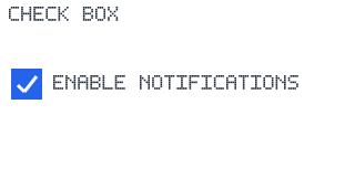
A deterministic render-only preview of Check Box (320×160), produced through the
render-only evidence path (Widget.render → SkiaViewer.captureScreenshotEvidence,
ViewerRenderTargetPng) and validated decodable / non-1×1 / non-trivial via
Testing.readPngArtifact. It shows the control rendered against the default
DesignTokens.Light theme.